 Tyler Field
US Cartograph
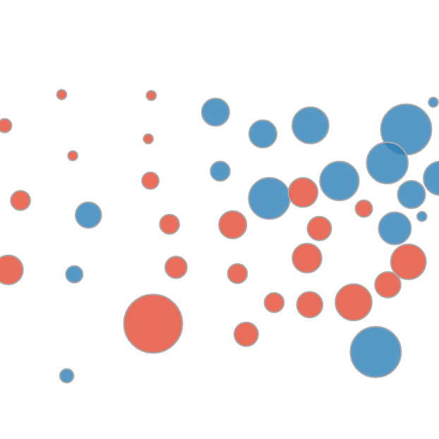
A way to visualize data about the states; in this specific implementation, representation in Congress.
Sometimes data about the US gets visualized using a choropleth, but this can lead to problems interpreting the data based on land area rather than the variable under consideration. Sometimes data gets visualized with every state represented as uniform shapes such as squares or hexagons, which works well if every state is weighted equally. When considering congressional representation or electoral college votes, each state is weighted differently. This widget maintains a geographic representation of the states while allowing for each state to be sized according to some other variable.
I made a posting about this on Medium with examples of other types of data.