 Tyler Field
JohnSnow
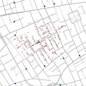
A recreation of Dr. John Snow’s famous map of the London cholera outbreak of 1854 using D3.
Houses with a deaths from cholera are marked in red, the size of the circle corresponds to the number of cholera deaths per household. Hovering on a household circle displays the count of deaths for that household.
Water pumps are marked in blue circles. Black lines mark the voronoi cells for the pumps. The points inside each voronoi cell are closer to the pump for that cell then to any other pump. Mousing over the cell shows the count of deaths that occurred inside that cell.