 Tyler Field
IRS Migration Map
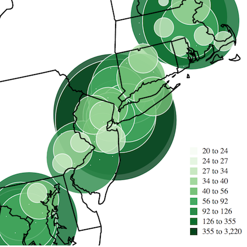
The IRS publishes data on migration patterns within the US based on changes in taxpayers’ return addresses. This is an ongoing project to visualize and explore that data, with special attention on San Francisco. Eventually, the project might be modified to explore any county in the US.
For this project, I used D3 v4 to create the map. I couldn’t find a chart library using v4 that behaved the way I wanted, so I ended up adapting some code I had written in the reusable chart pattern.
Most of the data-munging is automated using command line tools like grep and sed then JavaScript scripts run using node. The county of interest can then be specified by FIPS code. As an initial proof-of-concept, I scripted the creation of animated gifs as well.